Lessons Learned: Check The Mobile View March 2, 2017 05:00
Desktops and laptops are quickly taking second fiddle to the cellphone. People are using their mobile devices to do more and more on the internet everyday. Case in point: one day last week we printed shipping labels, invoices, and fulfilled orders from my cellphone.
This particular lesson learned is kind of a no brainer, but it is still something we have to remind ourselves all of the time: ALWAYS CHECK THE MOBILE VIEW OF YOUR WEBSITE AND E-MAILS!
Every tweak you make has to be considered from the perspective of all viewing platforms. On many occasions, even though the new website tweak / addition looked amazing on our computer screen, we had to make adjustments in order for the mobile view to be functional. Sometimes this came at a cost to the computer screen perspective, leading to a final decision that was a little less amazing but bridged across platforms. Here is one example:
On the 2017 UPstudio Planner page we have a viewer loaded that enables you to flip through a sample of the planner to get a feel of the layout:

Do you notice how the viewer looks a little small? It doesn't align with all of the other text when viewing it on your computer screen? However when you view this same section on your phone it all aligns perfectly:

Originally when we loaded this viewer, we customized the size to fit your computer screen, and we thought it looked great:

But this meant that on your cell phone in most cases it exceeded the screen width and required you to scroll left and right, making the navigation not as seamless:

Since we haven't figured out how to write code for this view to change sizes based on the viewing platform (on our list for the future), we had to decide what was a higher priority. In this case, the mobile view won, and the viewer looks a little small on your computer screen, but it is easy enough to click to enlarge.
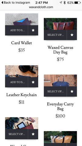
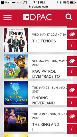
Over the past few months I've saved other examples I've run across. Some of these examples are pretty large companies, so don't beat yourself up next time you come across something on your site you forgot to check out on your mobile device, it happens to us all. I'm sure all of these look great when you're sitting behind a computer screen.
For your viewing pleasure: