Planning a Planner v2018, Part V August 24, 2017 05:00
This week is the last installment of the Planning a Planner v2018 blog series. We saved our favorite reveal for last. But first, a quick recap on the last four weeks:
Planning a Planner v2018, Part I: We shared that we are adding 6 more graph pages and that we are shifting the page numbers closer to the edge of the page so that it makes the bottom four lines easier to utilize.
Planning a Planner v2018, Part II: We revealed the new future planning tool we've added at the end of the year preceding the graph pages to keep track of your dentist appointment 6 months into 2019. A sample of the layout was included in the post.
Planning a Planner v2018, Part III: In 2018 the folders will be slightly upgraded: fabric sides for a higher quality feel, and the front folder was adjusted slightly to make it easier to access and more versatile.
Planning a Planner v2018, Part IV: The monthly layouts in 2018 will have a Monday-Sunday layout to be consistent with the weekly layouts. This is the change we contemplated and vetted the most. We hope you welcome the change and are excited to give it a try.
What did we save for last?

There will be two cover color options in 2018! There will be a limited quantity of satchel colored planners available. You might recall that we did a poll on the blog a while back regarding color options. Based on those that voted on the blog, satchel won by a long shot, however we had many that reached out to us specifically about red. Originally we were very torn. In the end we felt that the satchel held more true to the foundation of our brand: versatility.
In the coming years we hope to add more variations. Maybe more colors, or an academic version, maybe different sizes, we'll let you all lead us. We are excited to see what the future holds.
We are super excited about the satchel addition and hope you are too!
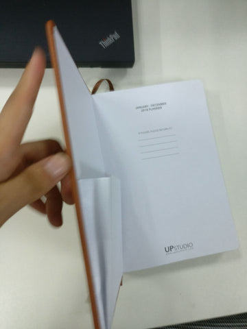
Here are some behind the scenes photos taken by our printer while planners were in production:


